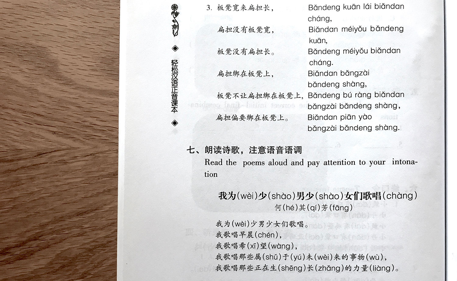
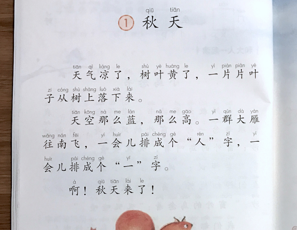
Wǒ ài pīnyīn!
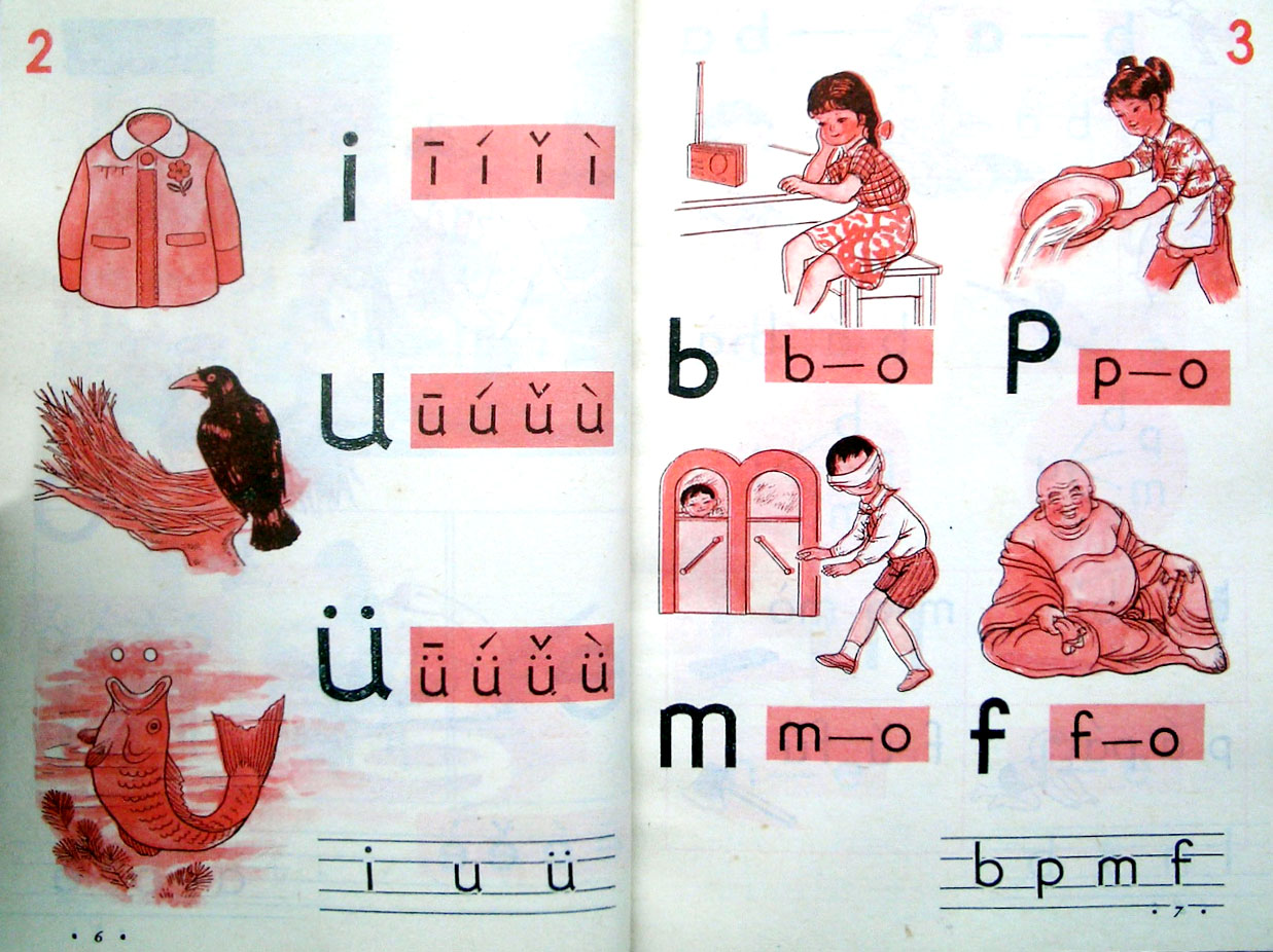
Pīnyīn in Chinese textbook for primary school, 1987
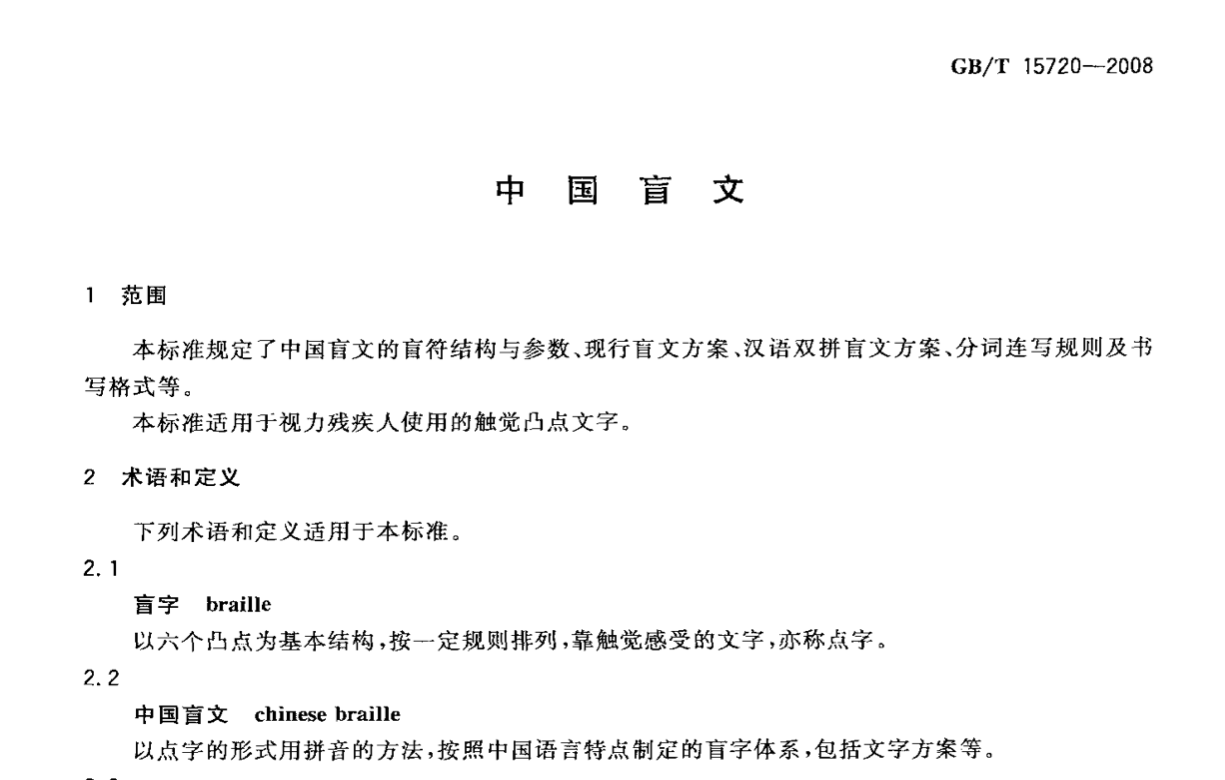
Chinese Pīnyīn is the official romanization system for Standard Mandarin Chinese. Published in 1958, it is the primary way to present Chinese pronunciation. It is taught in every school and must be learnt by both native and foreign speakers before they learn Chinese characters. Besides, the standardization of Braille, flag semaphore and sign language in Chinese are all based on Pīnyīn system.
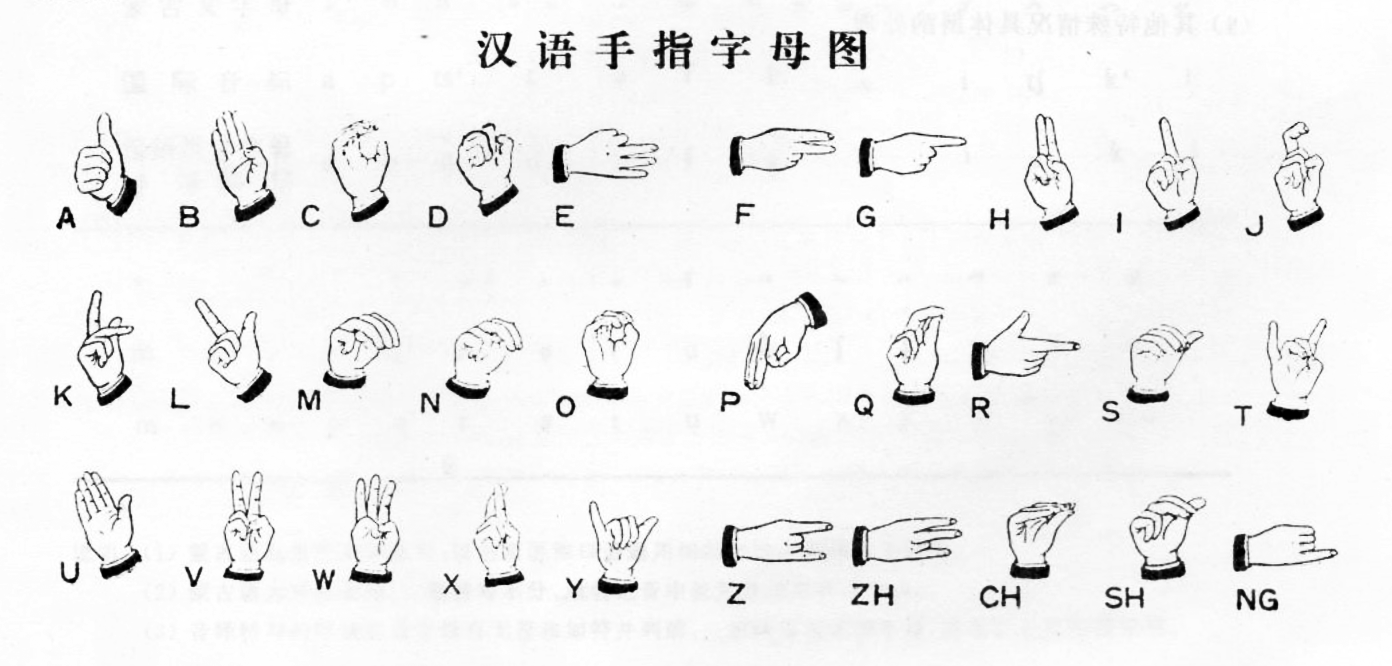
Sign Language alphabet based on Pīnyīn
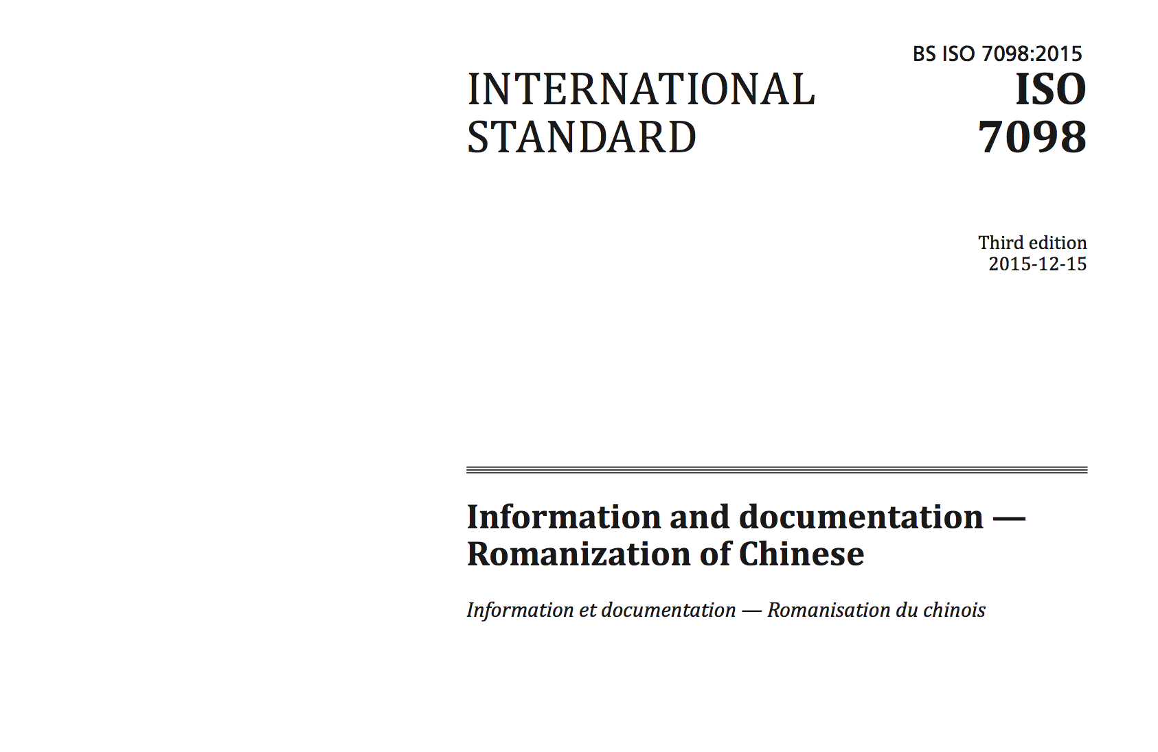
Pīnyīn has already registered in ISO as the only international standard for Chinese romanization. Billions of people in the world use Pīnyīn as input method for Chinese on computers and mobile devices every day.
When we need to include Pīnyīn in a piece of writing, there are a few points to check:
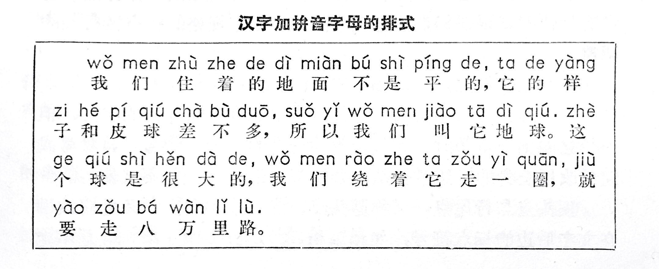
1. Separate Pīnyīn strings by word. According to the orthographic rules suggested by national standard GB/T 16159-2012, spacing in Pīnyīn is usually based on words, not on single syllables. Not everyone is familiar with this rule, since the basic unit of Hanzi is apparently single characters.
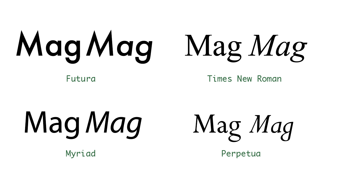
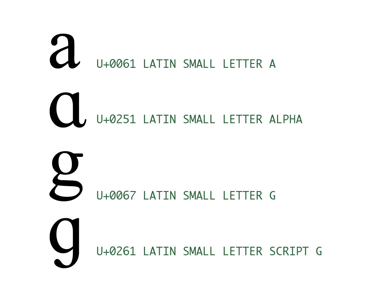
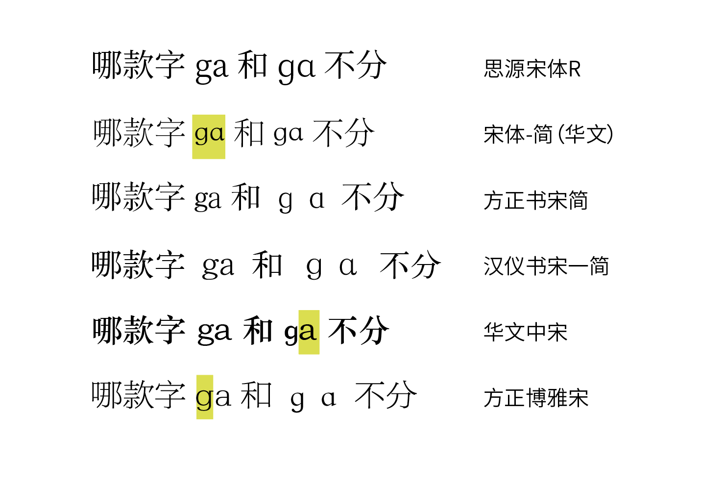
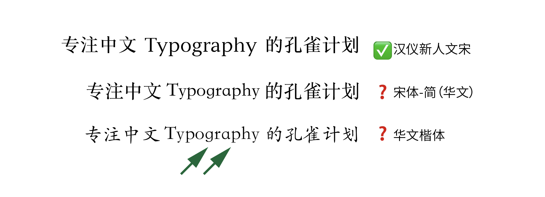
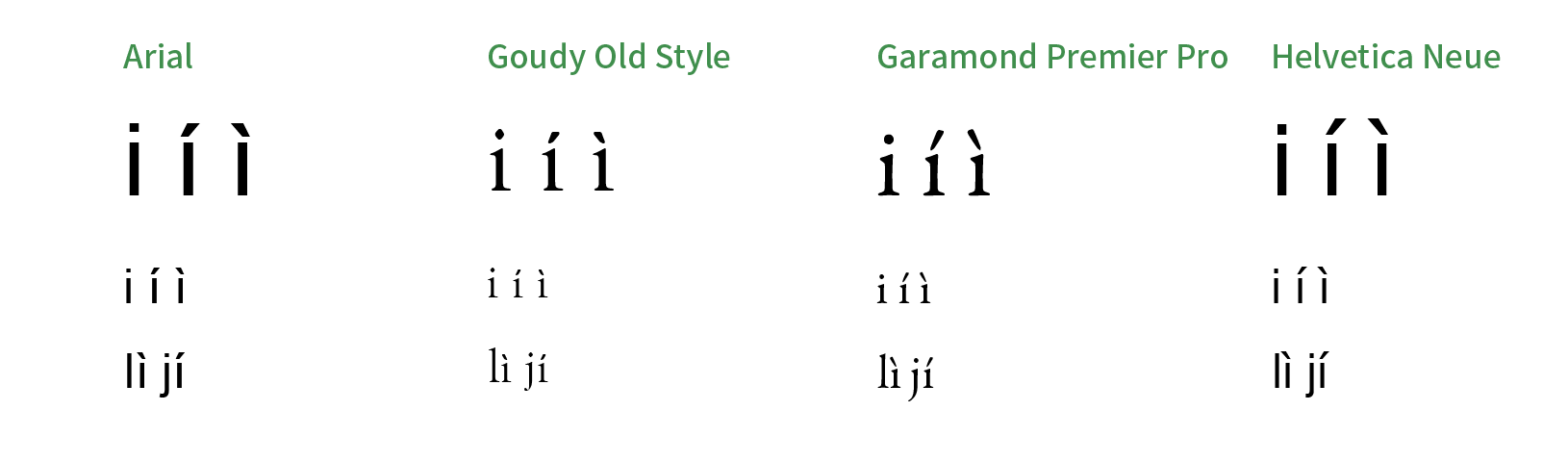
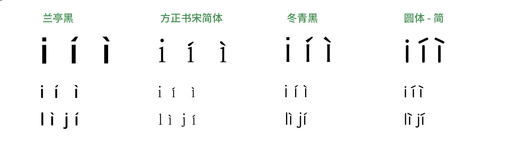
2. There are no restrictions on the forms of “a” and “g”. Some people insist using single-story ɑ and ɡ letters in Pīnyīn. They probably want to be consistent with the handwritten style in children’s textbooks, but it is totally unnecessary. Pīnyīn is a romanisation system, so we should follow Latin typography and regard alternative forms simply as stylistic differences.
<
The pinyin font used in the official document of the State Council of China publishing the “General Standard Chinese Character Table” is a forced single-story ɑ/ɡ, which is very inconsistent with the previous and next glyphs.
The W3C Requirements for Chinese Text Layout which the author also participated in editing clearly pointed out:
5.5.4.1 Basic requirements
- 8. Annotations usually use a sans-serif typeface which is rather thin and plump. It is generally the opinion in publishing and in education that Hanyu Pinyin must use those typefaces in which ‘a’ and ‘g’ are single story and the second tone mark is thick on the lower part and thin on the upper, as in the handwritten style of the stroke. Actually there have never been any national standards specifying the typefaces and the glyphs for Hanyu Pinyin.
- 9. The General Association of Chinese Culture in Taiwan once wrote to the Ministry of Education in Mainland China about the rules for the glyphs of Hanyu Pinyin, and received the response that the glyphs of the letter ‘a’ and ‘g’ correspond to those of Latin. There is no requirement demanding the handwritten glyphs.
In the “List of Standard Forms of Characters for Printing” published by Chinese government in 1965, the double-story a and g were naturally adopted in Pīnyīn.
In the previous article “Re-examining the Differences between Chinese and the Western type-setting”, I pointed out that the most fundamental difference between Alphabet type design and Chinese characters is that Western letters are designed based on the principle of proportional width, instead of monospaced. Chinese pinyin uses Latin letters, so it should also be “proportional” like Western letters, and tone marking letters should be no exception.
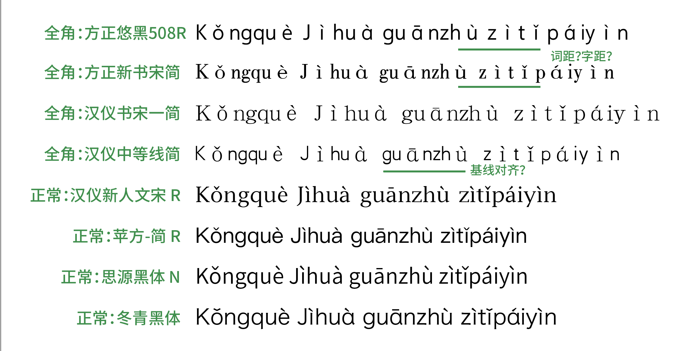
3. Pīnyīn letters are proportional in width. To preserve its legibility, Pīnyīn letters should not be fixed in full-width like Chinese characters. In some digital Chinese fonts, however, glyphs with diacritics are still set as full-width by default, resulting in typographic disasters for both Pīnyīn and other Latin words.
Some designs of alphabet in Chinese fonts will make glyphs of Pīnyīn with full-width
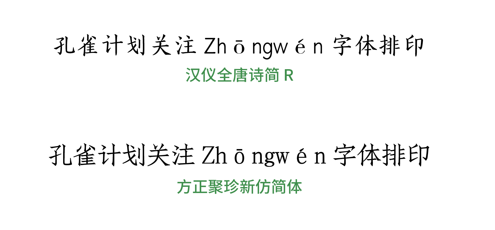
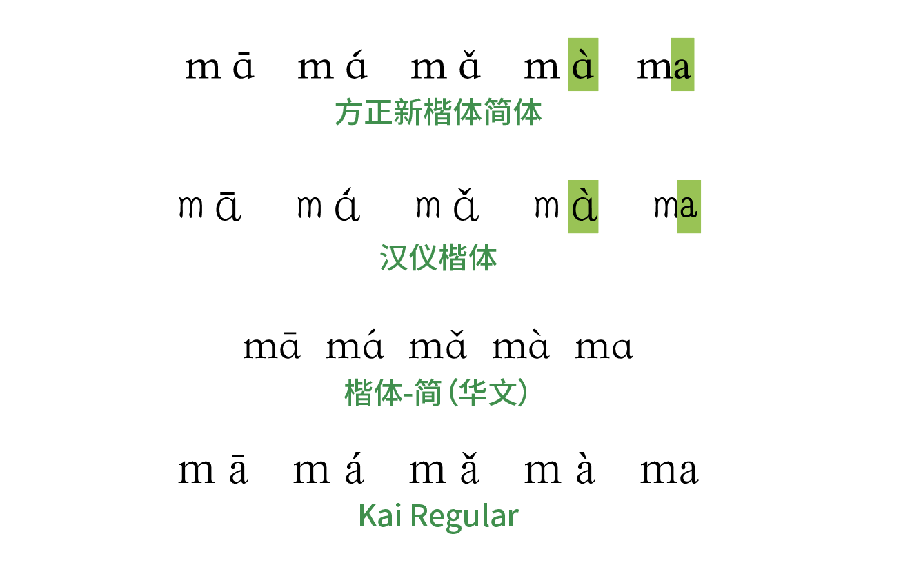
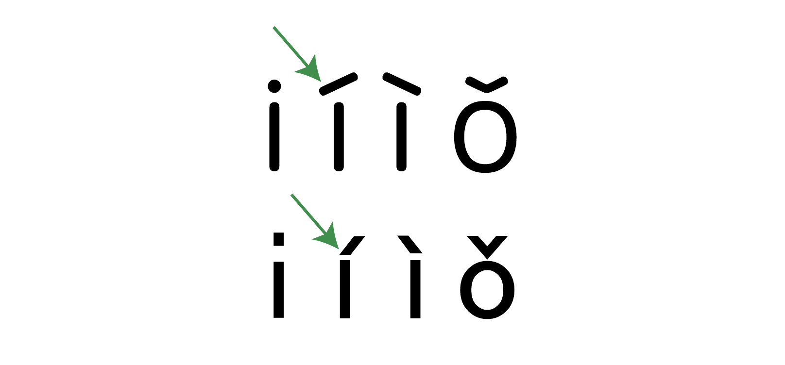
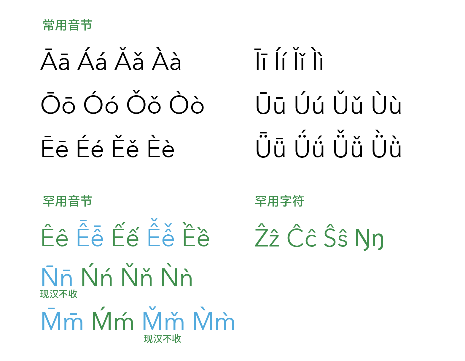
4. Tones are essential for Pīnyīn to represent correct pronunciation of Mandarin Chinese. It will not be a good idea to omit them when they can actually be printed correctly. The Pīnyīn system borrows diacritics from Latin script – macron (ˉ), acute accent (ˊ), caron (ˇ) and grave accent (ˋ) – to mark the four tones in Mandarin. The forms of diacritics in a font are often designed to match Latin letters, which might be slightly different from the particular needs of Pīnyīn. So if type designers want to go further, they can choose to make locale-specific glyphs for a faithful rendering of Pīnyīn tones.


Different drawings of the acute accent, used as the second tone in Pīnyīn. Top: ST Fangsong (Chinese font). Bottom:Adobe Garamond
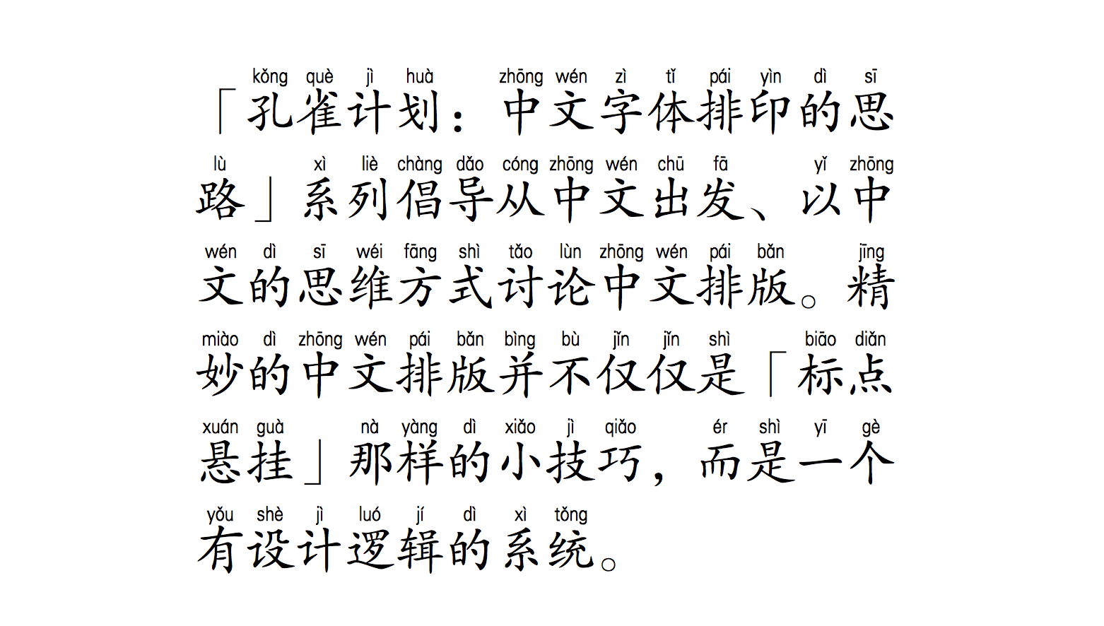
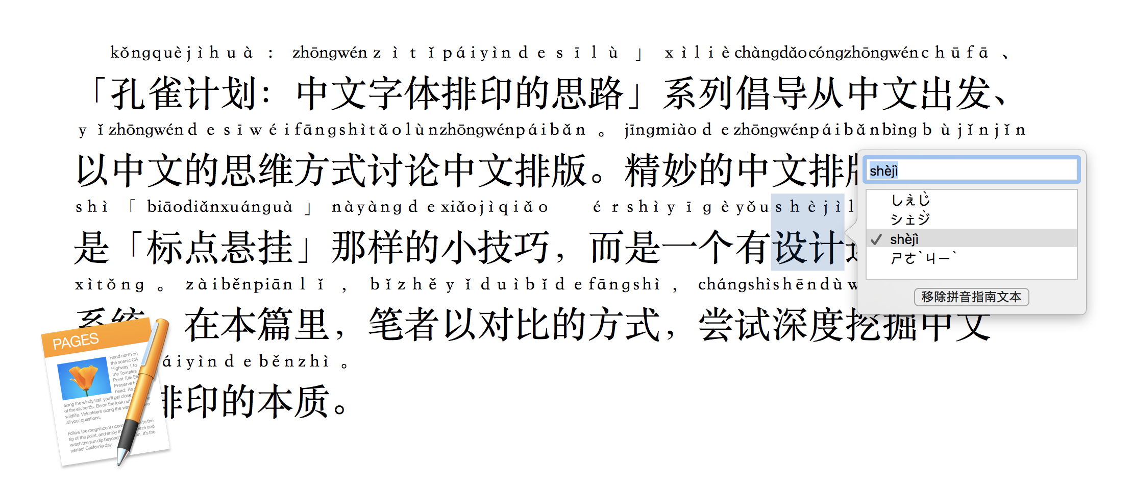
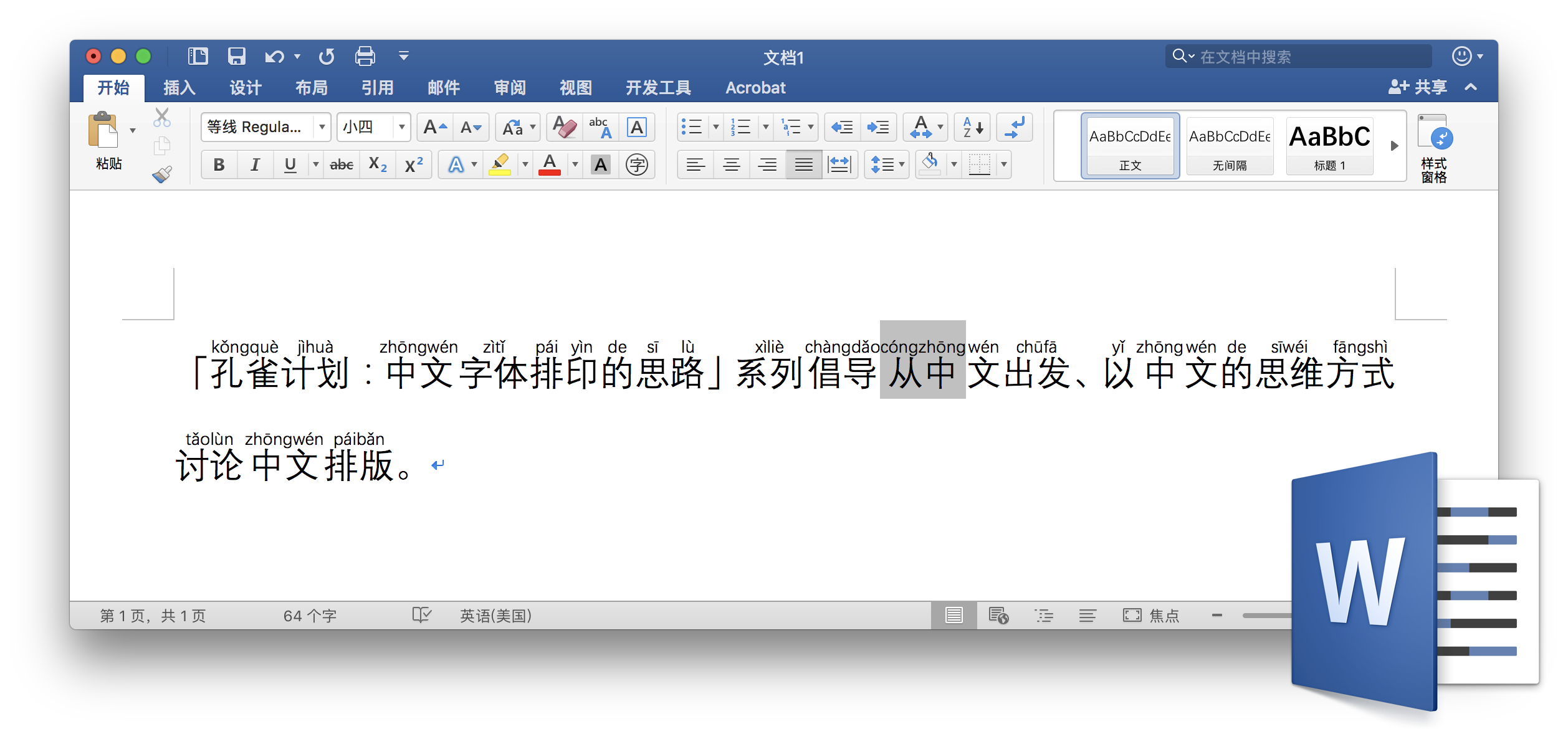
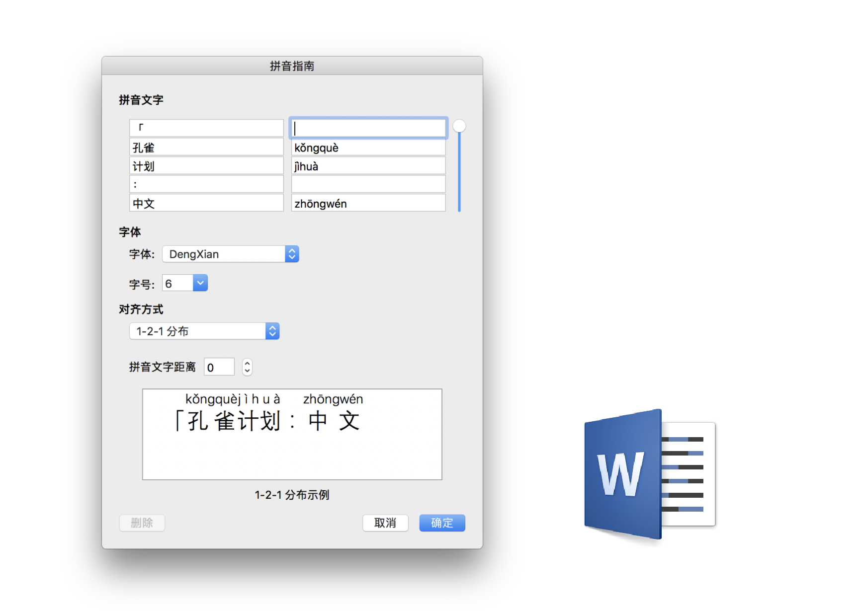
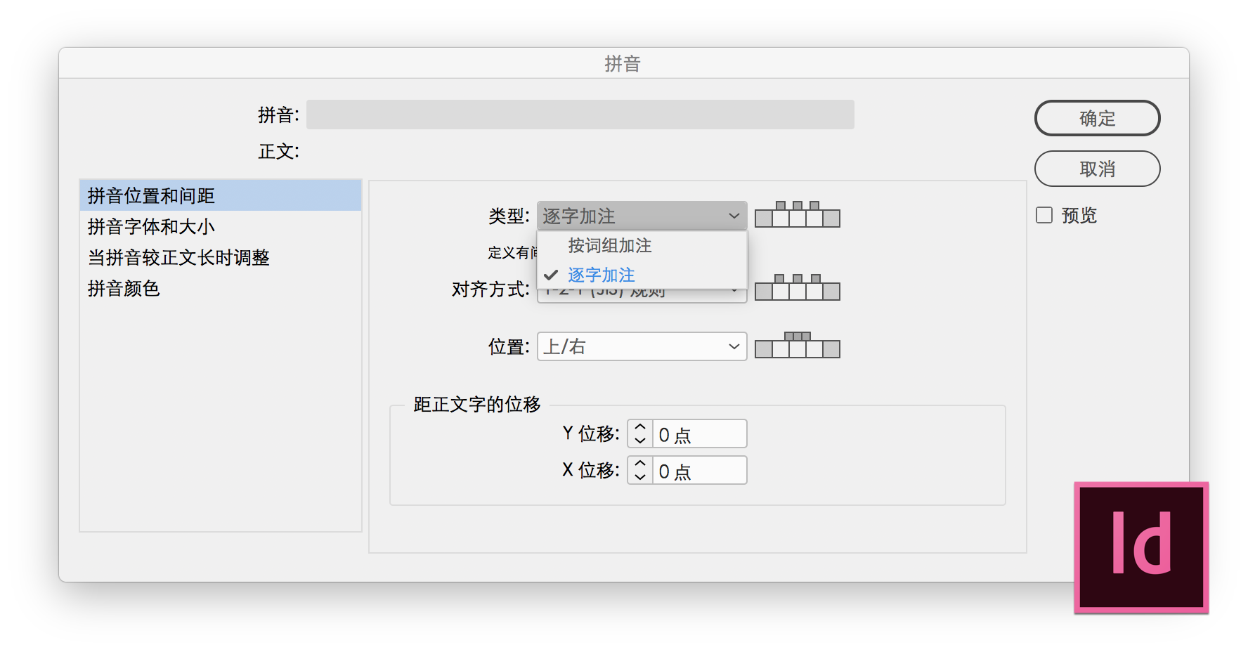
5. Set appropriate type sizes and determine alignment strategies for Pīnyīn annotations, which is often set between lines. In this case, sufficient leading is necessary to maintain the paragraph’s legibility. In the Japanese Industrial Standard (JIS), where ruby characters are used as phonetic symbols, annotative glosses are set to half the size of the body text, and it has become the default in typesetting software and web standards. However, simplistically transplanting Japanese practices may not always work: Pīnyīn uses Latin letters, and could often appear too small in such setting. When it comes to alignment, center-aligning Pīnyīn and the corresponding word.
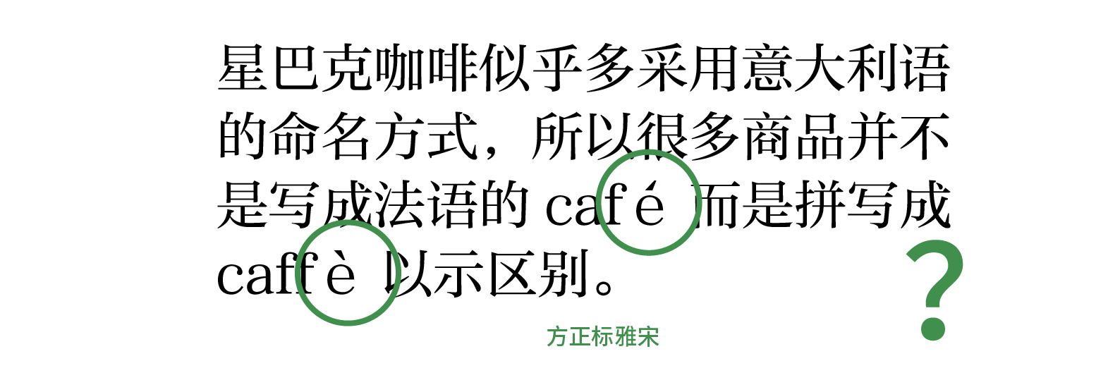
Another issue now surfaces: the Pīnyīn spelling’s length is not proportionate to the Chinese character(s) it represents. It can be very short or very long, e.g., 吉利 jílì (lucky) vs. 双床 shuāngchuáng (twin beds). That is left to the designer to adjust.
In Taiwan, Zhùyīn symbols (also known as Bopomofo, ㄅㄆㄇㄈ) are taught as phonetic symbols in primary schools instead of Pīnyīn. As a potential exemplar, the typography requirements for Zhùyīn can be found in Requirements for Chinese Text Layout on W3C website.

Japanese ruby annotation, Chinese Zhùyīn symbols, Chinese Pīnyīn
FounderType Kaiti Pinyin font
在网页排版方面,由于日本的推动,很早就开始了对注音的支持。