Research
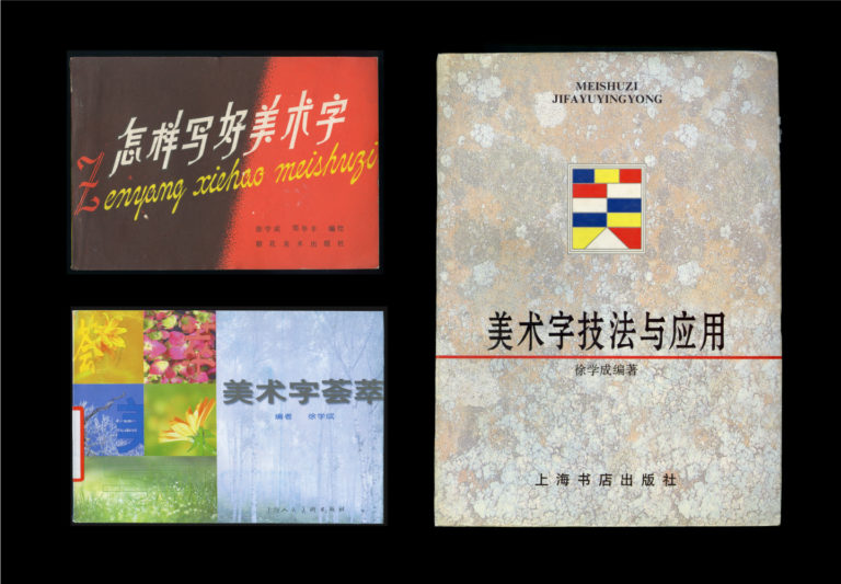
Xu Xuecheng (1928–2019), a pioneer in Chinese type design history
Under SPTRI, Xu contributed to the standardisation of Simplified Chinese character form design, a crucial step for the nationwide implementation of Hanzi reform. He co-directed the design of Heiti №1 & №2 (黑一, 黑二, similar to sans-serif/grotesque style). Often regarded as the archetypes of the later sans-serif Chinese typefaces, these two types were used in mass circulation, such as Cihai (“Sea of Words”, an encyclopaedic Chinese dictionary) and Selected Works of Mao Zedong. His other designs include Songhei (宋黑, hybrid of serif and sans-serif), Songti №7 (宋七, a classical style serif type), and many display typefaces. Most importantly, he and his colleagues started from scratch to explore Chinese type design theories and methodology through assiduous practice.