
Images: Amazon.com
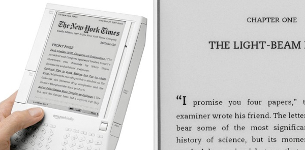
Amazon Kindle 电子读书器的推出确实火了一把,各大媒体给足了暴光率。乍看起来创新的东西细看起来有些惨不忍睹,尤其对 typo 人来说。Kindle 全部使用了 Caecilia 字体,由荷兰设计师 Peter Matthias Noordzij 于1990年设计。字体本身并不是一个坏选择,但所有杂志书刊仅提供一种字体实在是无趣和另人无法忍受的,试想读同一种字体、同一种排版的纽约时报、卫报和 WSJ 会是多么痛苦的经历;更不要说上千种书没掉了封面、排版和插图,用上同一种字体后会失掉多少的魅力。引用 Chip Kidd 幽默的说法:
On Monday November 19th, Amazon released something called Kindle, the latest 「e-book」 reading device. I’ve been asked to comment on what effect I think this will have, if any, on book design as we know it. Here goes.
None.
Sincerely,
Chip Kidd

7 个相关讨论
they should use arial, screen-optimised isnt it Rex?
i think i will buy it coz it can access wikipedia wirelessly for free.
but apparently only in us.
oh. anyway, i dont think any typo guy will read WSJ….
to sy’s anyway: true. but if u think typography only influence typo people, there’s really no point doing typo at all isnt it?
anyway, there are typo people in the uk read the ft. suppose there will be typo people in the us read wsj, wouldnt you think so?
yeah, i only see u read ft.
“but if u think typography only influence typo people, there’s really no point doing typo at all isnt it?”
I dont see ur point, i suggest arial, ur favour screen point. am i right?
u fool. no comment now.
i know i love to tease you. my colleague.