Yunfang Stencil
- Latin
- Chinese Simplified
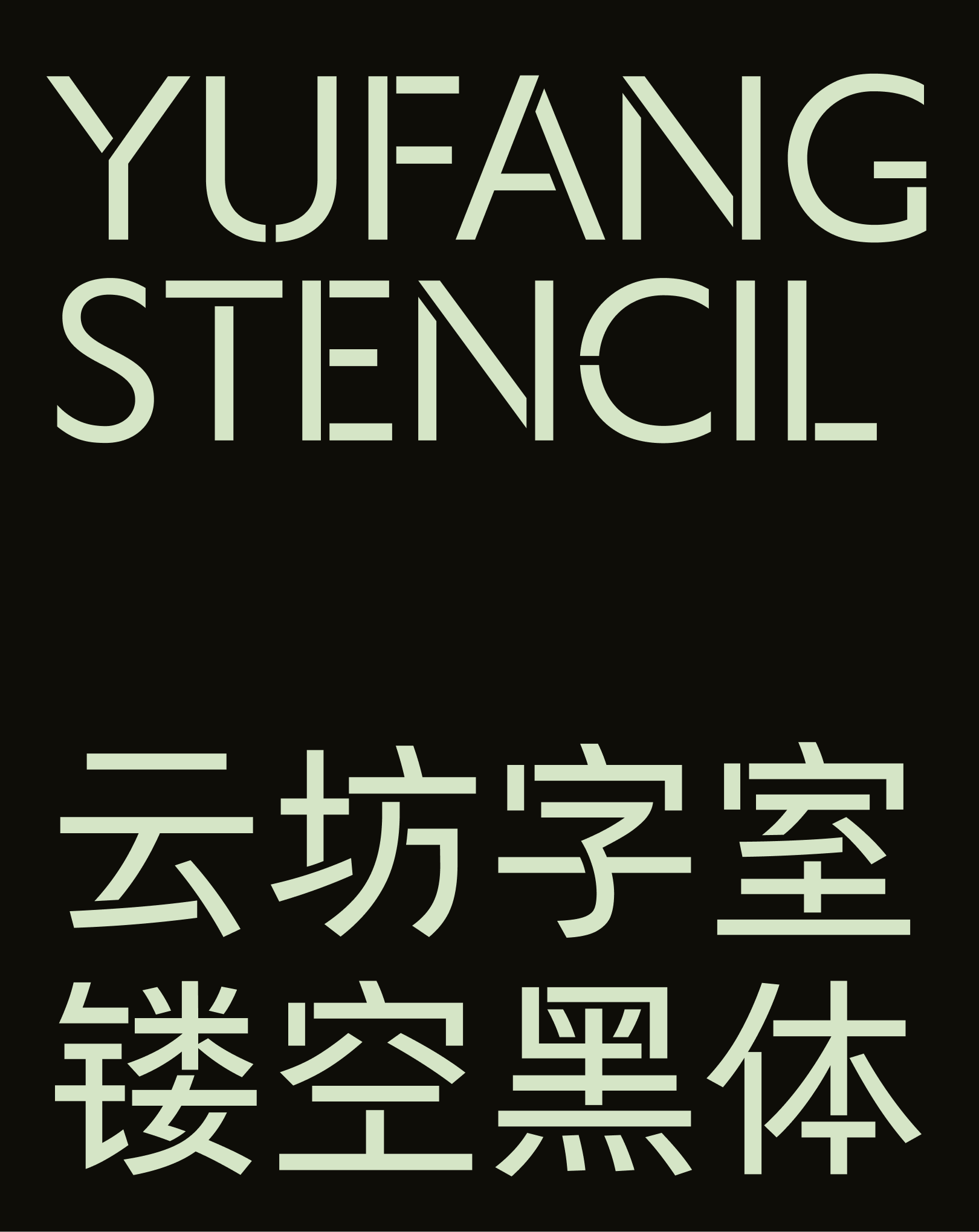
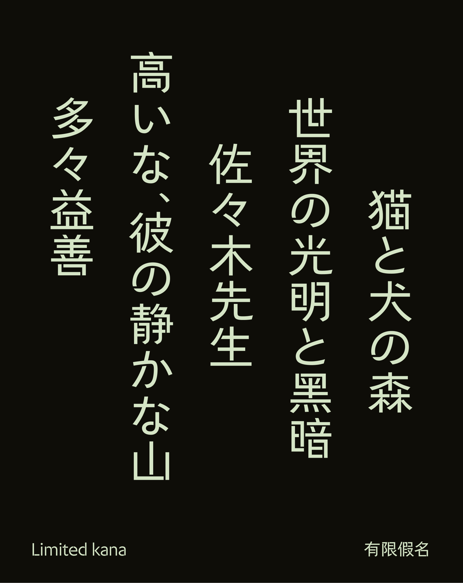
Yunfang Stencil
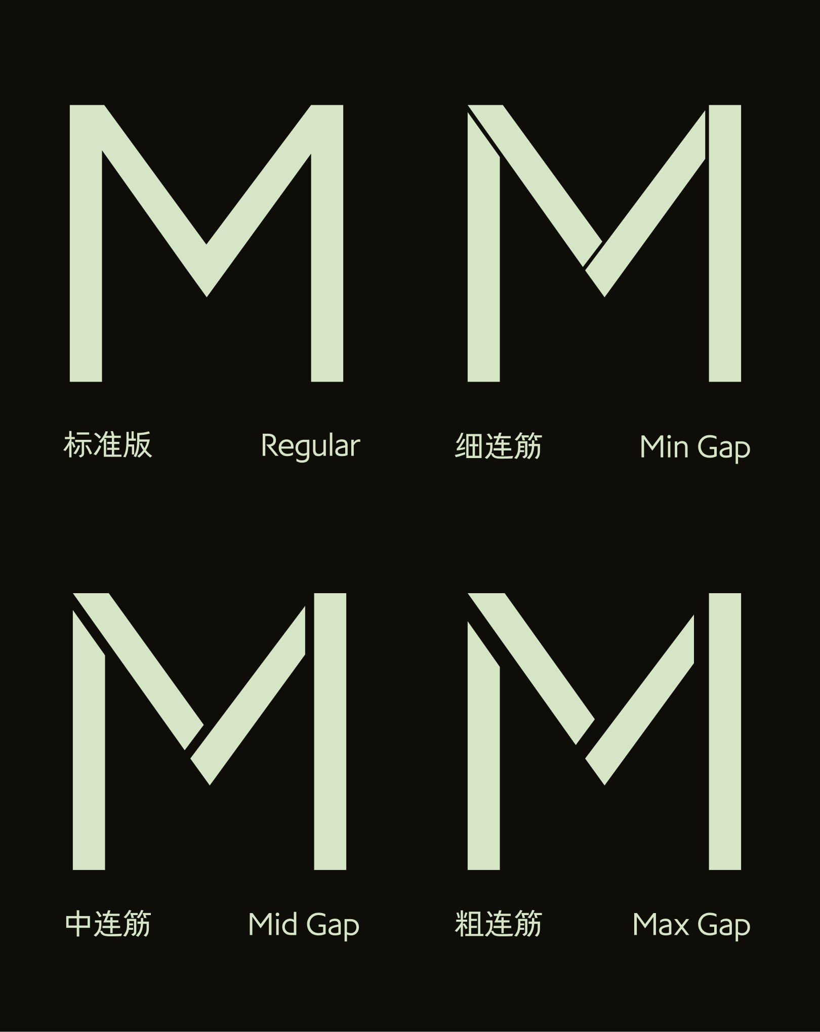
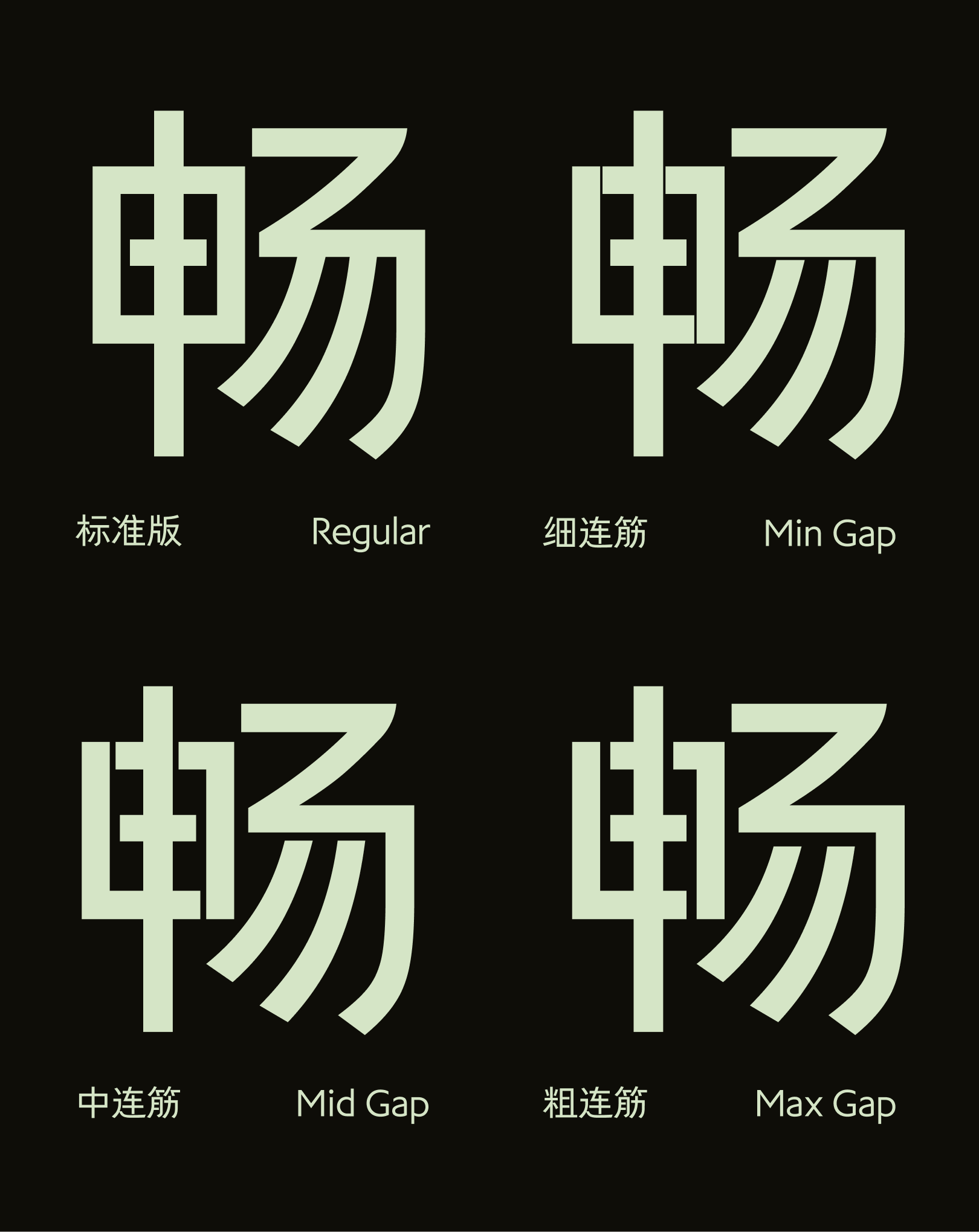
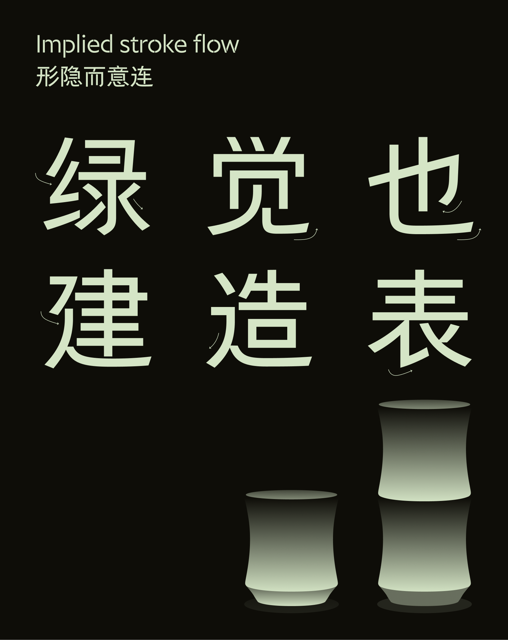
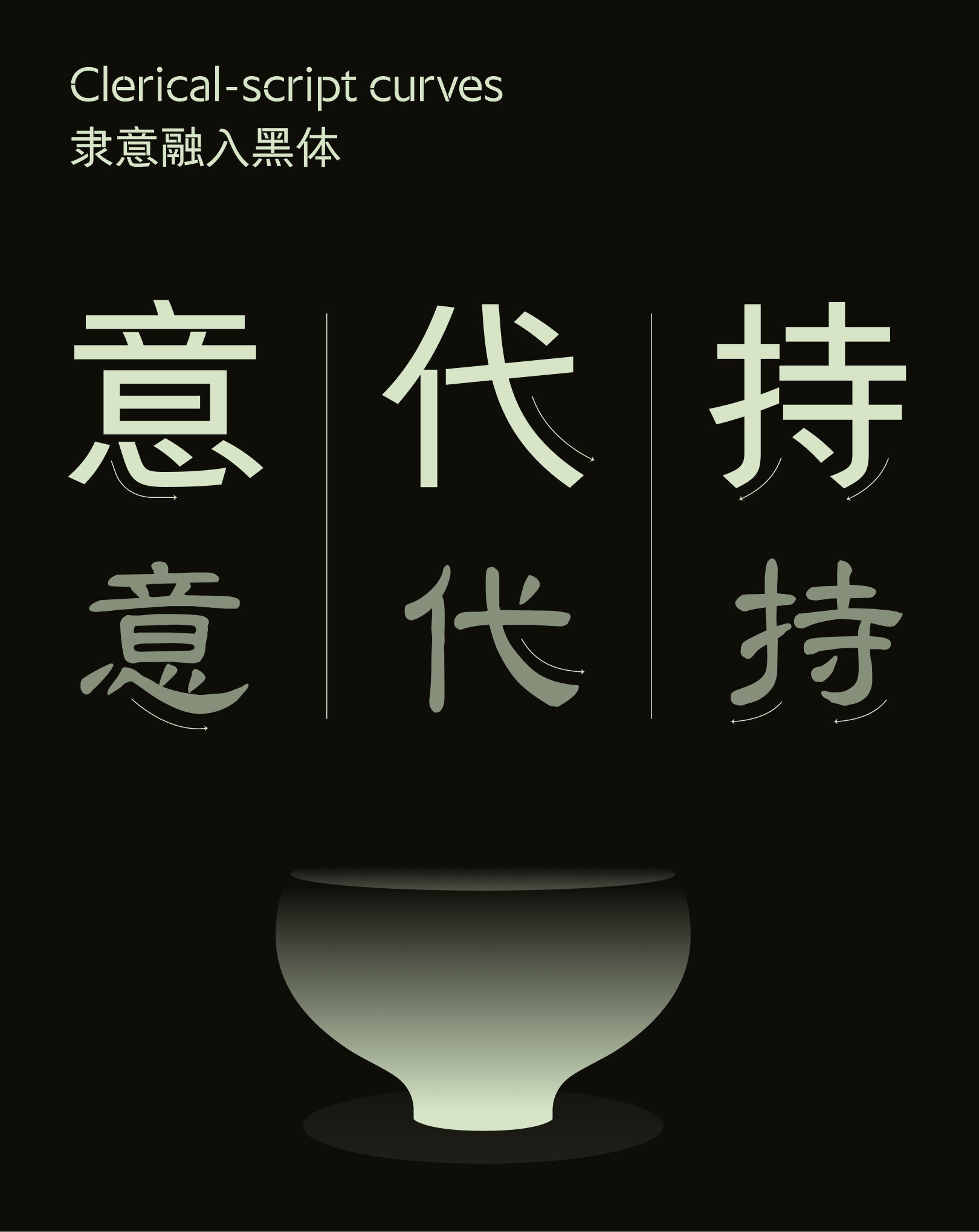
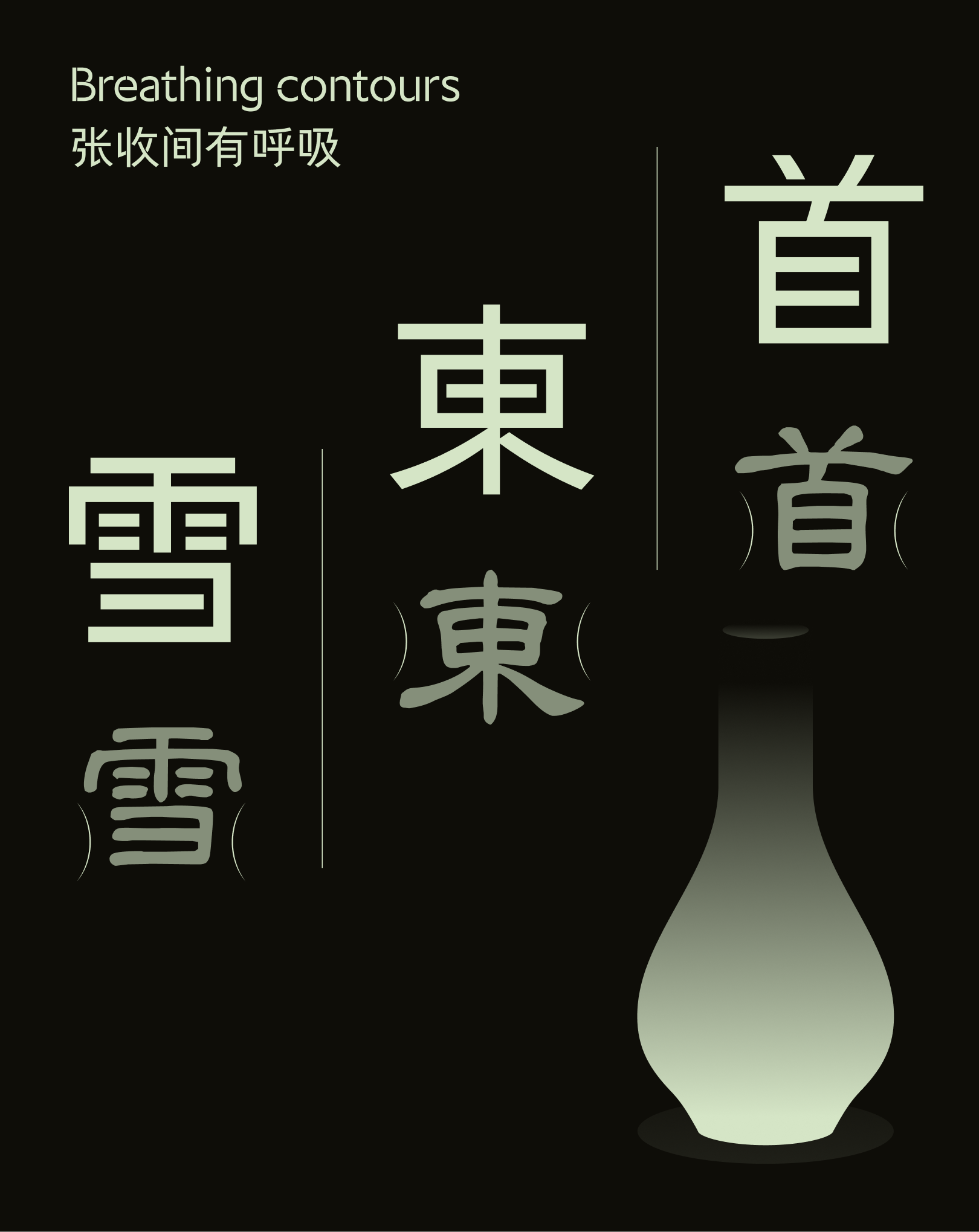
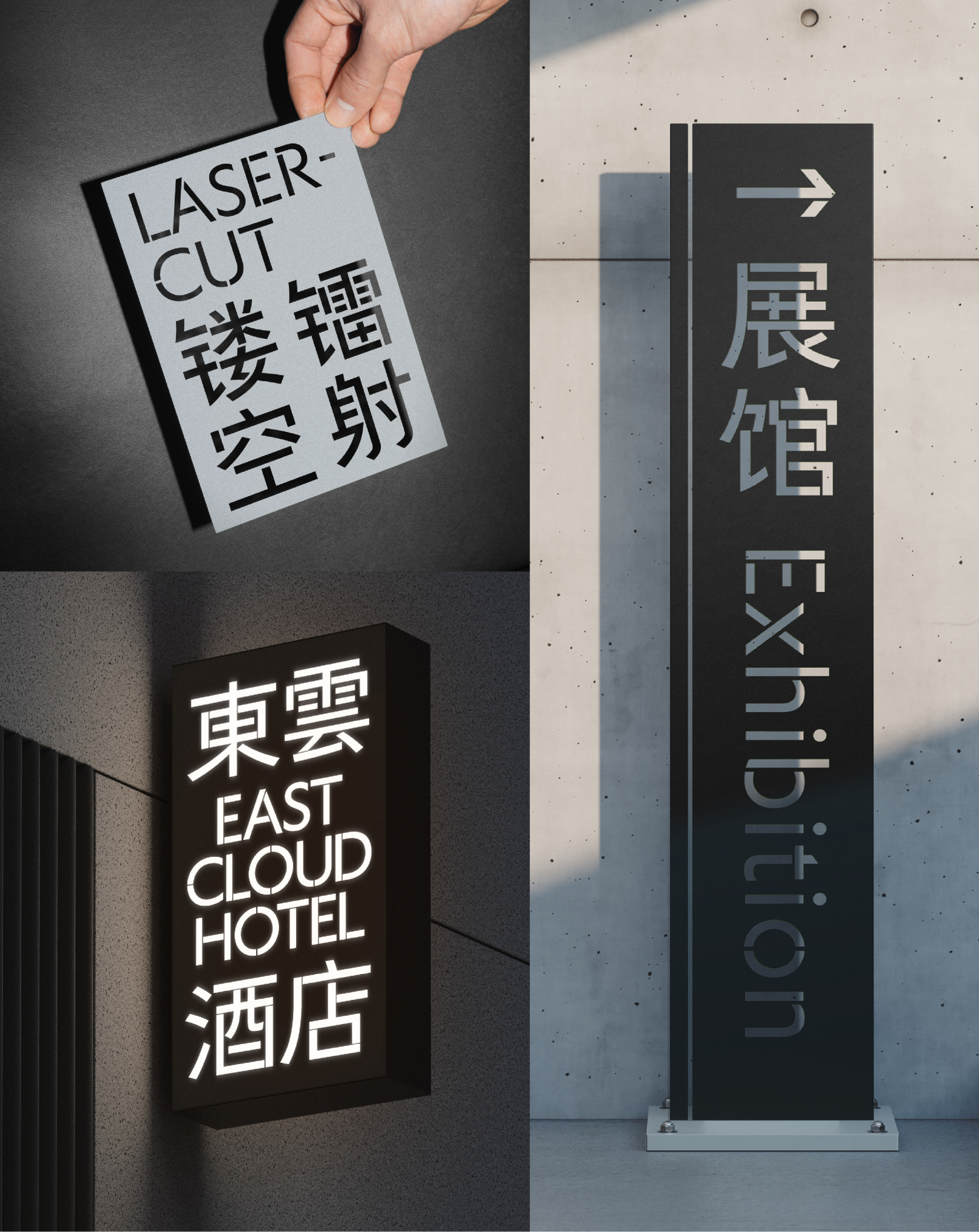
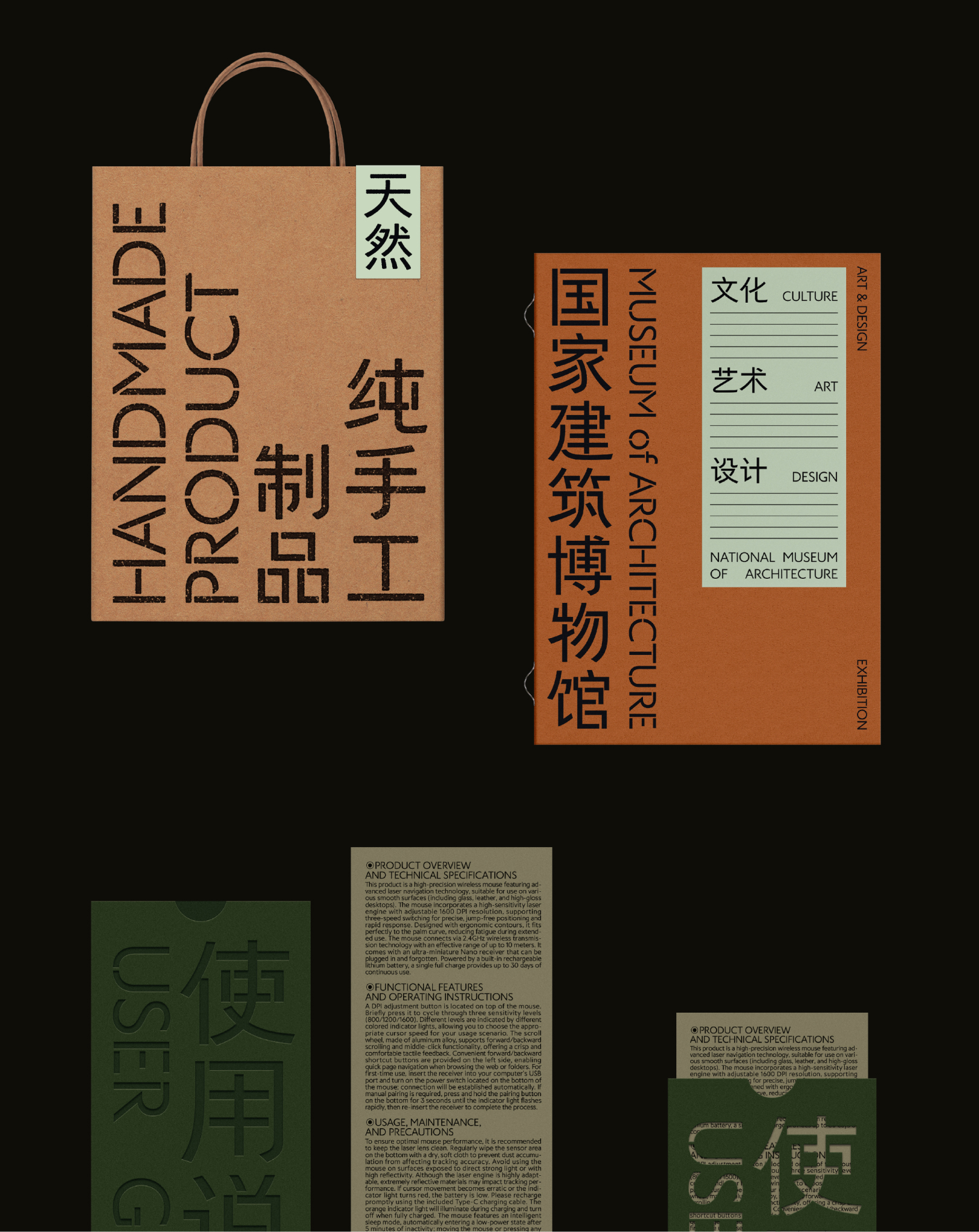
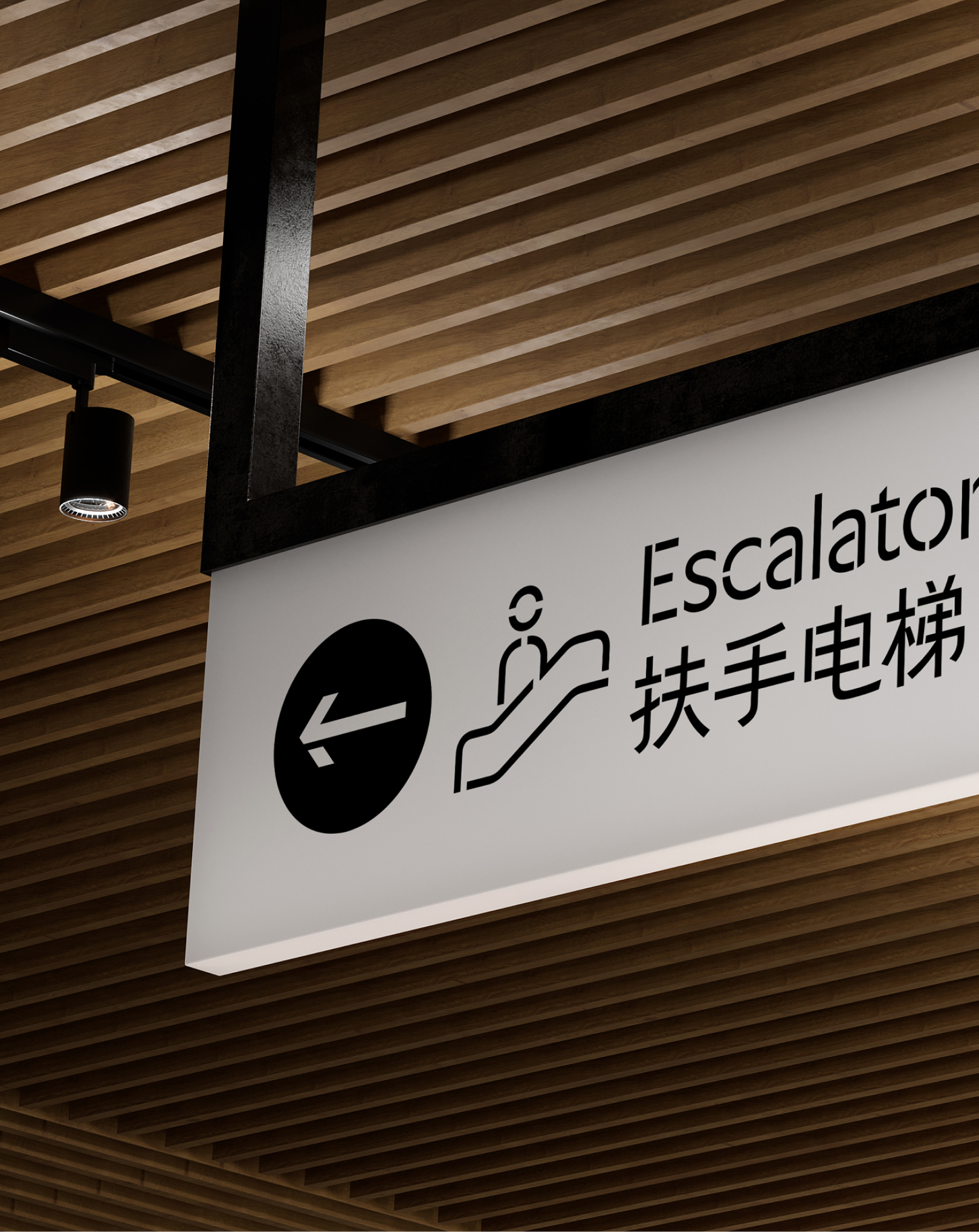
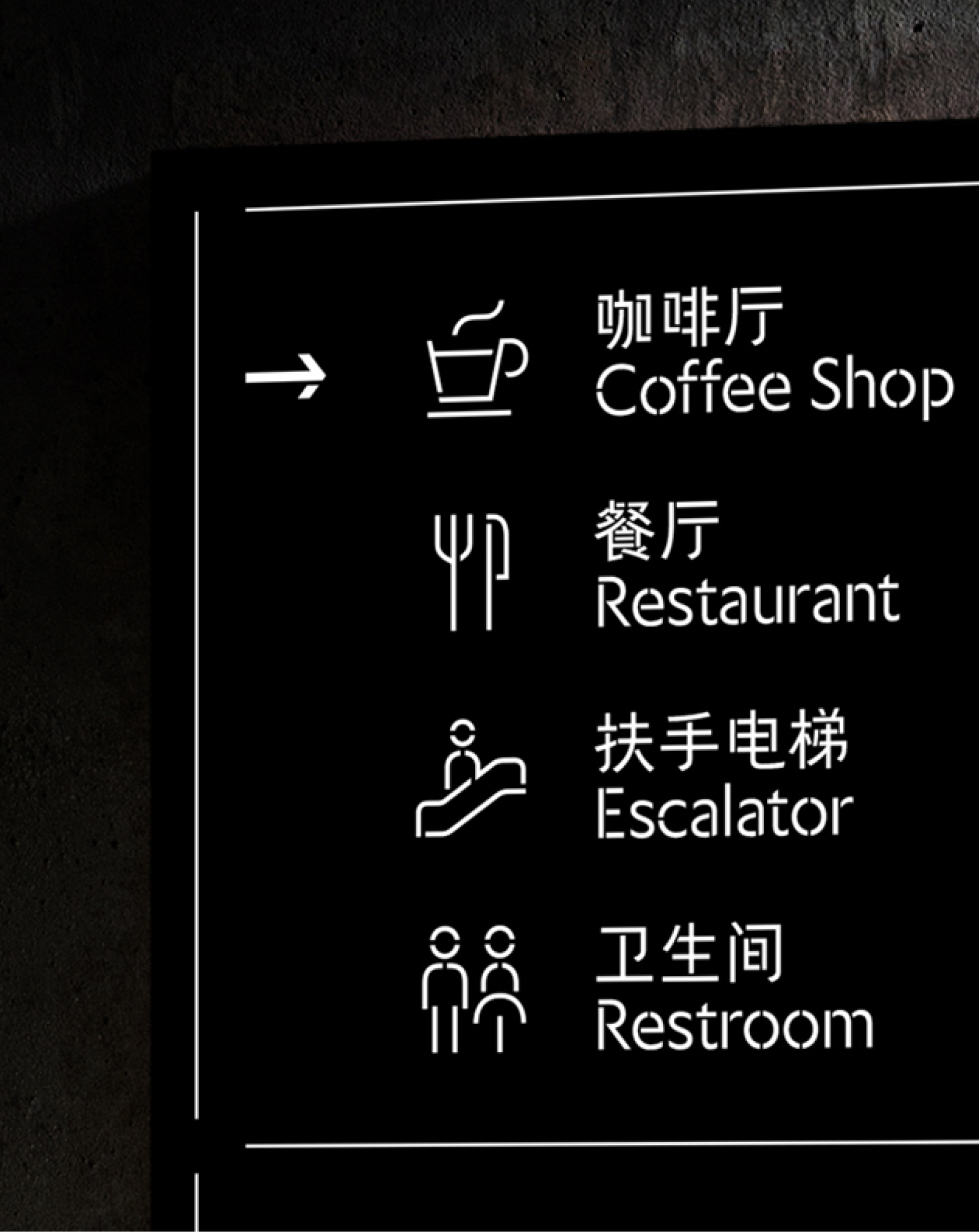
Yunfang Stencil is the first systematically designed Chinese stencil sans-serif. Addressing the complex structure of Chinese characters, we established systematic stroke-break rules to keep the stencilled parts structurally sound and the glyphs clear and legible. After the breaks, details such as spacing, centre of gravity and stroke weight were fine-tuned, so that the functional bridge design is both rational and beautiful. The font also comes in three versions with different bridge widths (Min-gap, Mid-gap, Max-gap) to suit different use cases.
Its bridge-free counterpart, Yunfang Sans, is a sans-serif designed for reading text. Its design blends the rhythm of traditional Chinese calligraphy with the clean order of modern design: modern and neutral on the outside, with a humanist warmth within, and a faint literary air between the letterforms. It suits styles such as New Chinese and International Style, and can also create a modern, refined, understated-luxury visual atmosphere.
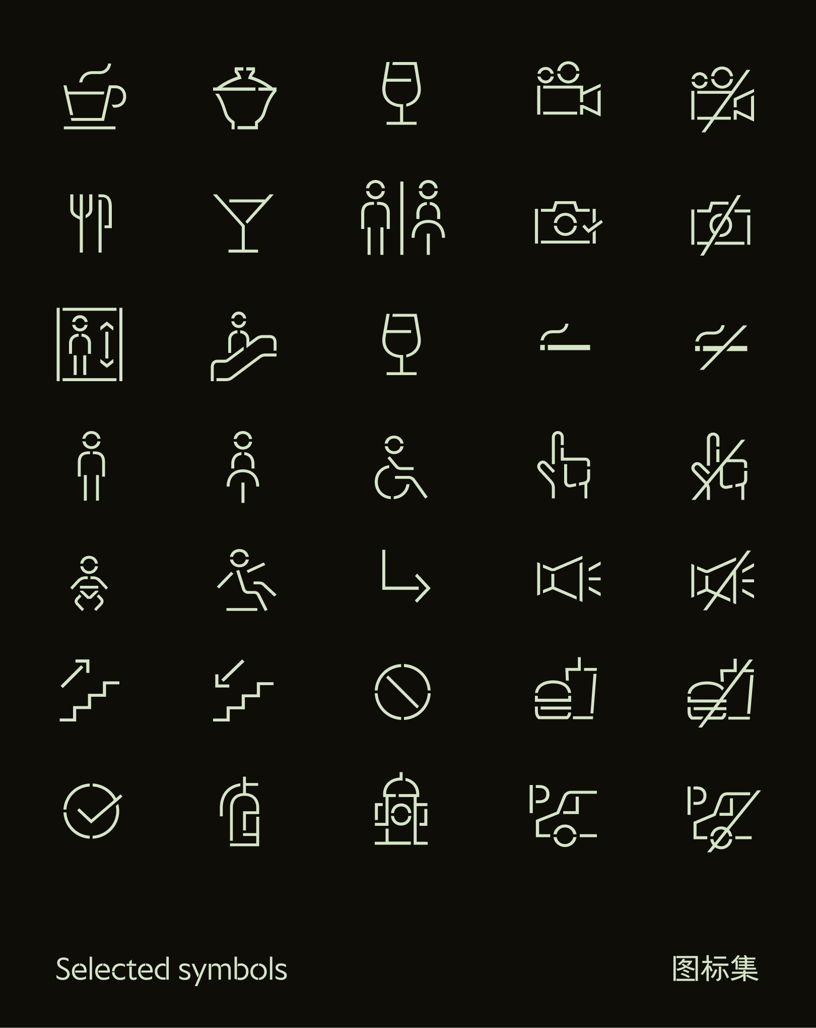
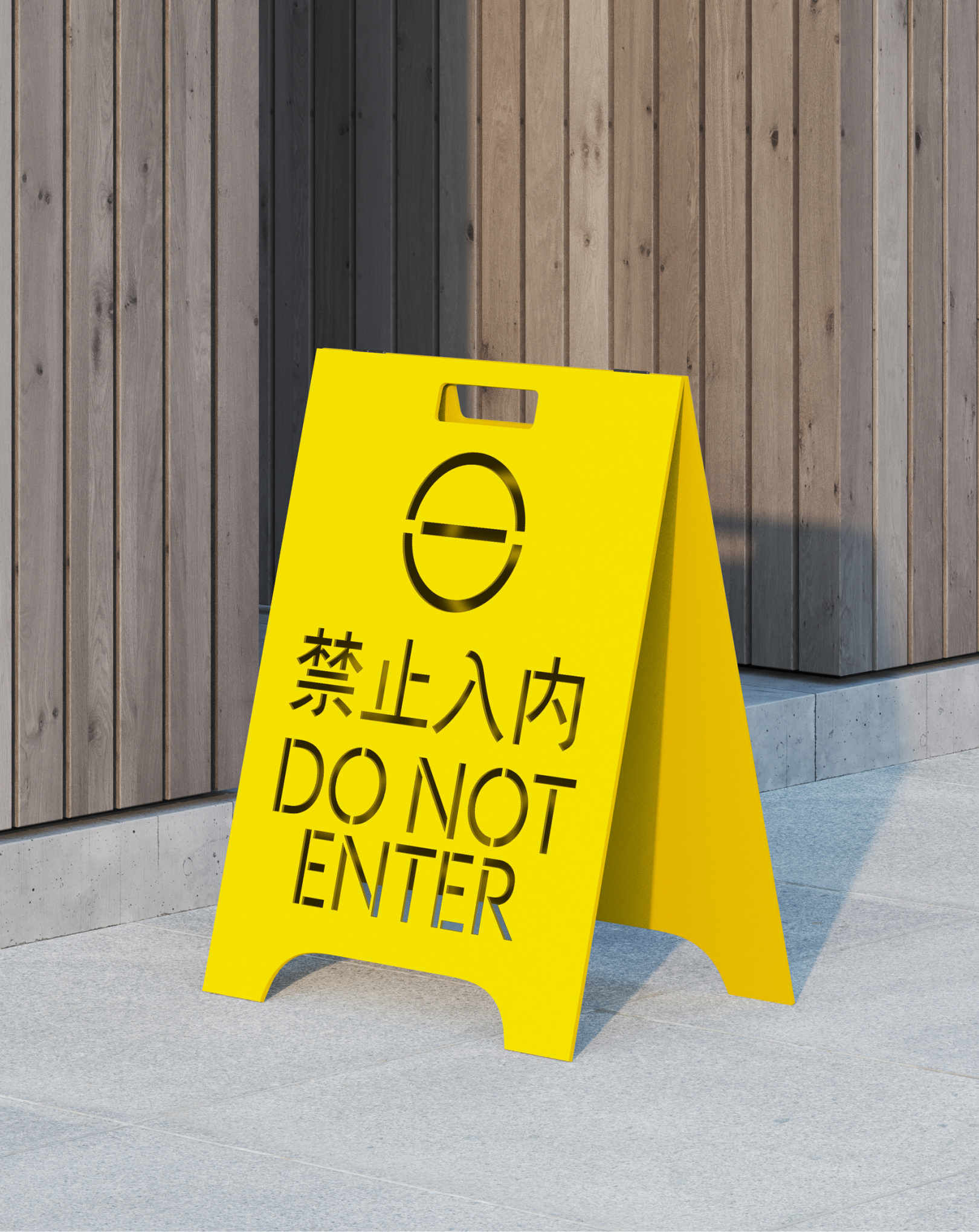
Given how widely stencil fonts are used in wayfinding systems, we also developed a set of wayfinding icons in a matching style and included them in the font’s emoji code points. Users can call them up directly without switching files or software, making wayfinding design more efficient.
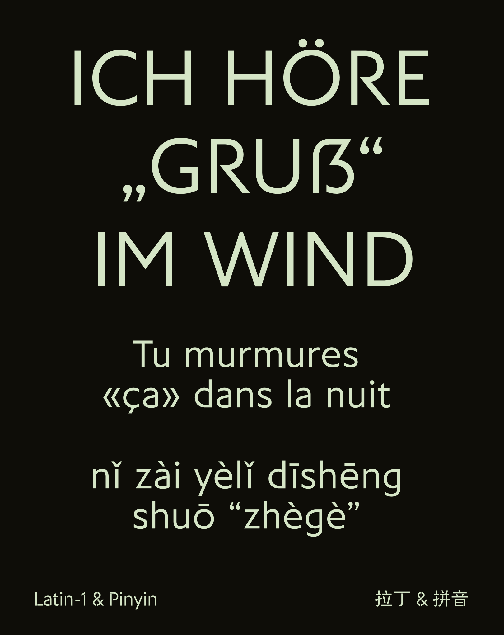
The Latin letters carry over the Chinese characters’ blend of humanism and modern simplicity. Although built on a skeleton of classical proportions, the descenders are deliberately shortened to better fit single-line, elongated layouts such as wayfinding signs, and to set well alongside Chinese. Details such as the tailless a, the pointed corners of d, g, p and q, and the broken strokes of P, R, X and y give the design a dapper, yuppie-ish playfulness.
- Latin-1
- GB2312
- Hanyu Pinyin
Design Background
Yunfang Stencil was born from a collaboration with an art and culture brand whose work spans curation, architecture and cultural products, with a modern, avant-garde and humanist character. While looking for a suitable text typeface for the brand, we found nothing on the market that fit this style, and so began this design exploration.
We care about the beauty of rationality and order, and we also noticed that design today is re-examining the simplicity and neutrality of flat design and the International Style. So we sought a new balance between neutral, restrained text faces and distinctive display sans-serifs, letting the font keep its rationality and practicality while carrying a subtle, distinctive visual personality. We call this just-right quality, neither too strong nor too faint, “slightly salty”.
At the same time, considering the use of spray painting, stencil cutting and similar techniques in art installations and spatial wayfinding, we made stencil letterforms a key design direction for the typeface. By collecting and analysing a large number of examples from the street, we re-examined the structural relationships and stroke-break logic of Chinese stencil characters and established a more unified and complete design method, addressing the inconsistent styles and poor legibility of traditional Chinese stencil lettering.
In the end, Yunfang Stencil became a dual exploration of visual character and functional application, seeking the right balance between rationality and personality, aesthetics and practicality.
Liu Yunlai
Senior type designer, Vice President of the Changsha Creative Industry Association, member of the Shenzhen Graphic Design Association, and member of Typemeet. He founded and runs Yunfang Type Studio, focusing on type design and development and custom brand typefaces. He previously worked at Hanyi Fonts and the international type foundry Black[Foundry], specialising in CJK type design and development.
He led the design and development of smart components for the Google Flex CJK project, and has designed custom typefaces for international brands including LEGO, Decathlon and Riot Games. His work has been recognised with professional awards including Hanyi’s Star of Font, Award360°, GDC and GRANSHAN.
Chen Zhihong
Graphic designer who previously worked at a brand design agency, focusing on brand visual design. In his spare time he enjoys writing, reading, photographing and setting letters, and follows all kinds of type-related news. His typeface Sicheng received an Honourable Mention at the Morisawa Type Design Competition.